As you are no doubt familiar, I don’t buy newer editions of books if there’s an earlier printing with a much better cover out there. I have always stuck to this maxim throughout my time collecting books and it’s certainly not going to change any time soon. Except for this series of books that is. I had decided to replace my slightly tatty, rather dull looking copies of The Metamorphosis and The Trial with older editions and maybe add a few more titles to my Kafka collection. I began to search on the web and after a short while came across a rather striking cover for The Castle which I really liked. After a little digging, it turned out to be part of a uniform edition by Schocken Books from 2011.
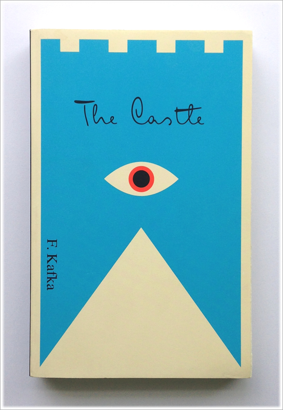
Since then, I have replaced my older copies with this much newer reprint and added a couple more titles from the same series. The artist responsible for the design work is Peter Mendelsund who has used eyes as a unifying device across each book cover in addition to a palette of block colours and typeface based on Kafka’s own handwriting.
He explains a little about his use of eyes on his blog as follows;
“I find eyes, taken in the singular, create intimacy, and in the plural instil paranoia. This seemed a good combo for Kafka who is so very adept at the portrayal of the individual, as well as the portrayal of the persecution of the individual.”
For me, this is a rare move away from older covers to newer ones although with designs like this, can you really blame me?
The Metamorphosis by Franz Kafka

The Trial by Franz Kafka

The Castle by Franz Kafka
Amerika by Franz Kafka


Fantastic.
LikeLike
I thought you’d enjoy these as a fellow Kafka reader Mr Lestaret.
LikeLike
Brilliant! Great covers, great pics. A big like from me 😉
LikeLike
Thank you kindly Mr cafe, glad you liked the covers and pictures.
LikeLike
These are terrific, one of the pleasures of design always has to be viewed as the end result, it cannot be described.
Some of the covers I have seen on your blog (and have commented on) are wonderfully complicated (such as the expressive Ian Miller, the book you recommended is quite superb), and here we have a set of seeming simplicity, yet they are absolutely wonderful and evocative.
One of these days I am going to blow up and frame some book covers and hang them around my office.
Thanks as ever for showing me something wonderful!
LikeLike
Thanks for the comment Franzwesten, I totally agree with you regarding the pleasures of design. This is why I tend to cut the waffle and just present the covers to speak for themselves. I have a number of photos of covers framed and ready to hang, they truly are pieces of art on their own terms.
Glad to hear you’re enjoying the Miller art book too, it’s become a well thumbed tome for me.
All the best.
LikeLike